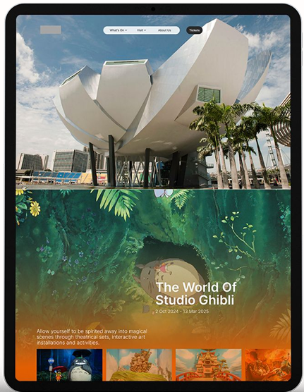
ArtScience Museum wanted to launch a website redesign as part of its rebranding. The museum struggled to guide users clearly toward meaningful engagement. Diverse audience needs—ranging from casual browsers to first-time visitors and members—were competing within an unclear information structure.
This project focused on rethinking the site’s information architecture, content hierarchy, and key user journeys to better align user intent with business goals. By clarifying who the site was for, what each page needed to do, and how users naturally navigate, we created a more purposeful experience that strengthens ASM’s identity while supporting conversion.

How might we leverage site existing wealth of content to deliver it in a more meaningful way that reinforces ASM’s distinctive identity?
How might we guide users towards boosting ticket sales & increase the visibility of high-conversion pages?
How might we drive membership sign ups that is relevant to the user’s journey?
Research to gather user insights, segments and preferences
Assess website effectiveness against ASM target audience
Improve usability and reduce frictional points of user journey
Based on user interviews, Google Analytics data, and ASM’s intended audiences, we identified several core user segments. To understand how each segment engages with the website, we mapped their journeys against key website drivers.
We identified two primary drivers:
This framework allowed us to design experiences that balance brand resonance with decision-making clarity.


Once we have established our target audiences, we reviewed the current site structure to understand the navigability & impressions of the site through the different lenses of each type of visitor.
We reviewed each page to understand its primary user intent and role within the overall site. Based on this, we reorganised pages into clearer hierarchy levels to establish a more intuitive content structure.
This improved wayfinding by aligning with how users naturally navigate—scanning broadly first before narrowing down to specific content.

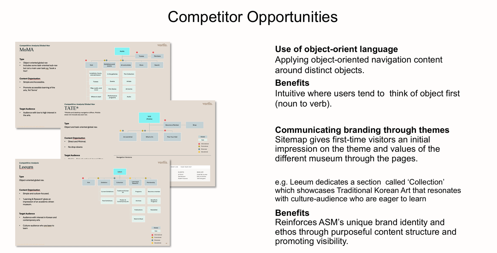
We identified an opportunity to strengthen ASM’s identity as a cultural icon by examining how the museum engages its target audiences beyond surface-level content. Through a competitive analysis of museums with similar ethos and positioning, we clarified what distinguishes ASM within the cultural landscape.
These insights informed which content blocks should take priority, giving the site a clearer vision and a more focused expression of ASM’s identity.
Our next focus was streamlining the ticketing flow to reduce friction in the purchase journey. We evaluated the interaction cost at each step to understand the cognitive, emotional, and physical effort required from users.
This analysis surfaced key pages and interface elements that created friction, allowing us to prioritise improvements that made ticket purchasing more seamless.

.jpg)
These foundational principles guided our design decisions throughout the project. The key challenge—and opportunity—was to leverage ASM’s extensive content and present it in a way that felt clear, purposeful, and meaningful to users.
New users are often unfamiliar with the museum’s breadth of content. To support clarity and consistency, we established content principles that guide how each page communicates its intent, purpose, brand voice, and identity.
These principles ensure a cohesive and unified experience across the site—helping users understand where they are and what to do next, without feeling overwhelmed or sidelining essential corporate content.
Users typically scan for what they are looking for before what they can do. By using object-oriented labels (noun before verb), users can quickly assess whether a page is relevant to their needs.
Prioritising users’ immediate goals reduces friction, lowers bounce rates, and makes each visit more purposeful.
Insights from Google Analytics and user interviews showed that a significant portion of ASM’s audience accessed the site on mobile. While visual theming remained important, mobile users were primarily task-oriented, with a clear goal of booking tickets quickly.
This led us to adopt a mobile-first approach, designing intentionally for limited screen real estate. Every element—from layout and imagery to animations and interactions—was optimised to support fast, purposeful actions.